Project
This project was for a graphic design class at UC Berkeley. The assignment was around developing an identity for an entity that is already in business. I enjoy mountain biking a lot, so I decided to re-brand The Marin Museum of Bicycling.
Tools used for this project was pencil/pen and paper for iterating over numerous logo concepts and Adobe's Photoshop, Illustrator and InDesign.
Mood Board
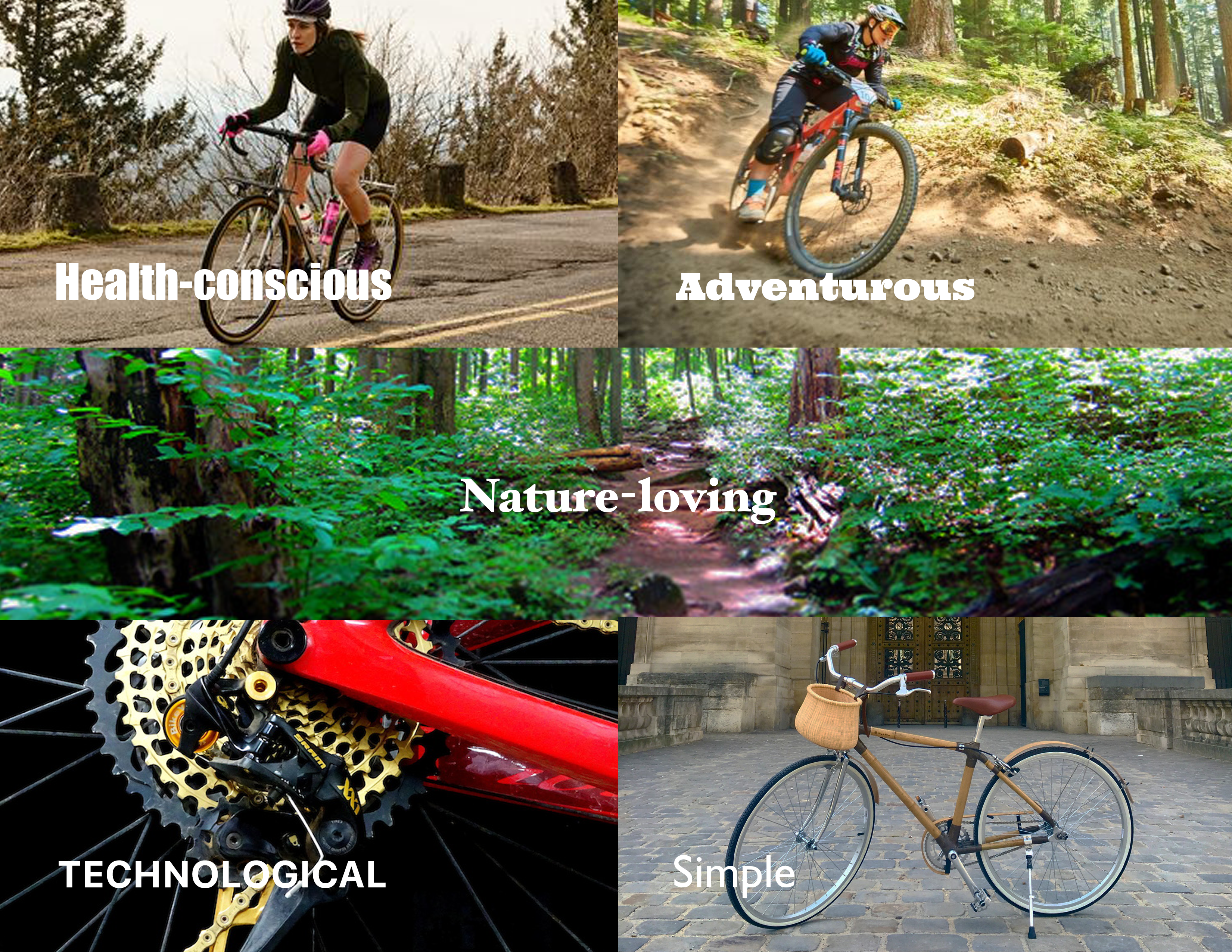
The first step in the project was to identify the overall tone of the experience, as well as the target audience. I did this with the help of a mood board.
The mood board helped me identify key words that would help me decide on a color palette and a typographic palette. I was able to pull the following descriptive words from my mood board: health-conscious, technological, nature-loving, adventurous and simple.
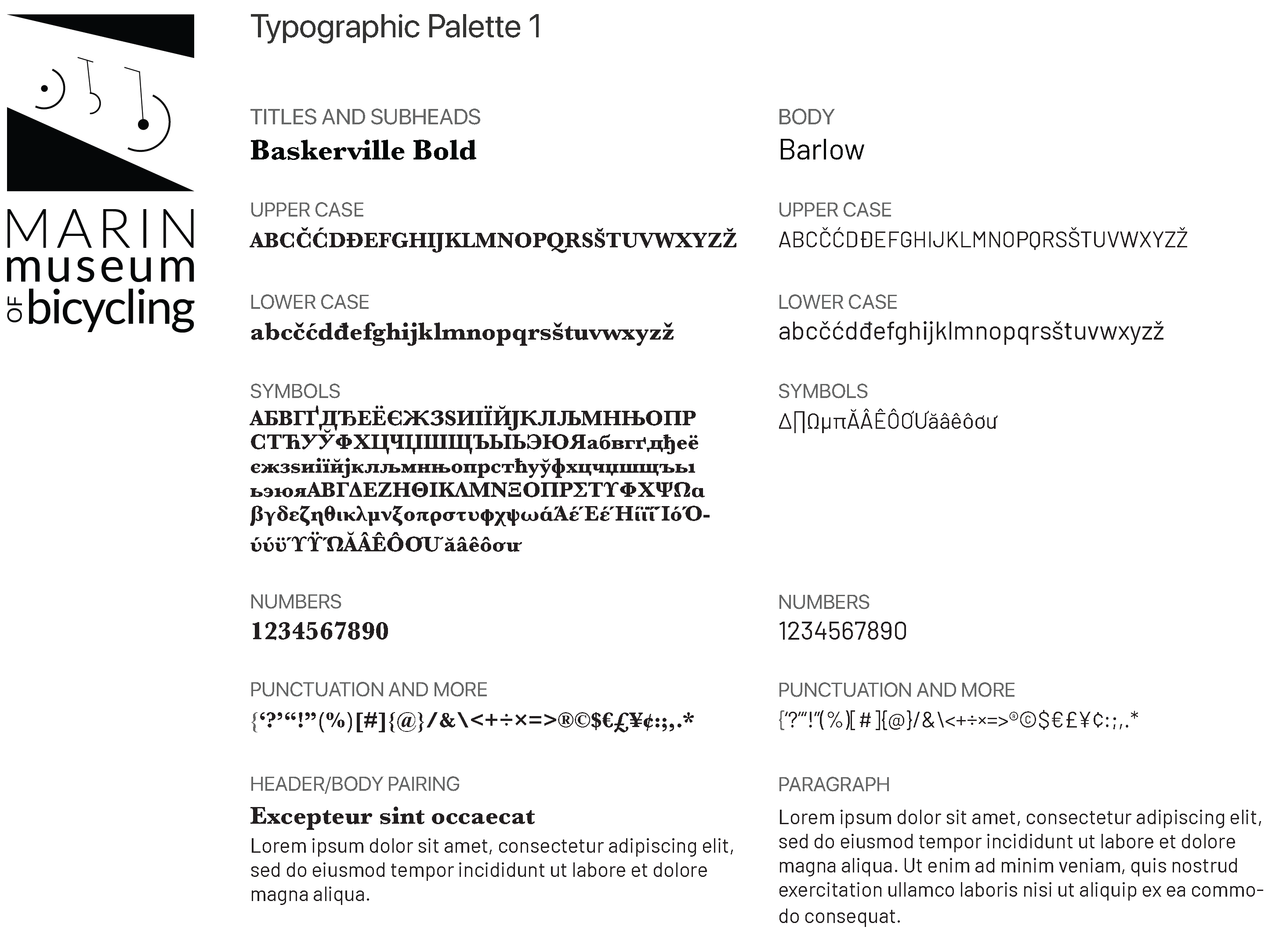
Typographic Palette
I decided to use a bold, serif font-family for headings and titles. I liked Baskerville's simple and classic look. It works well with most sans serif font-families as well.
I liked Barlow's sleek and clean look. It works nicely with Baskerville and helped enforce a healthy, simple and technological branding.
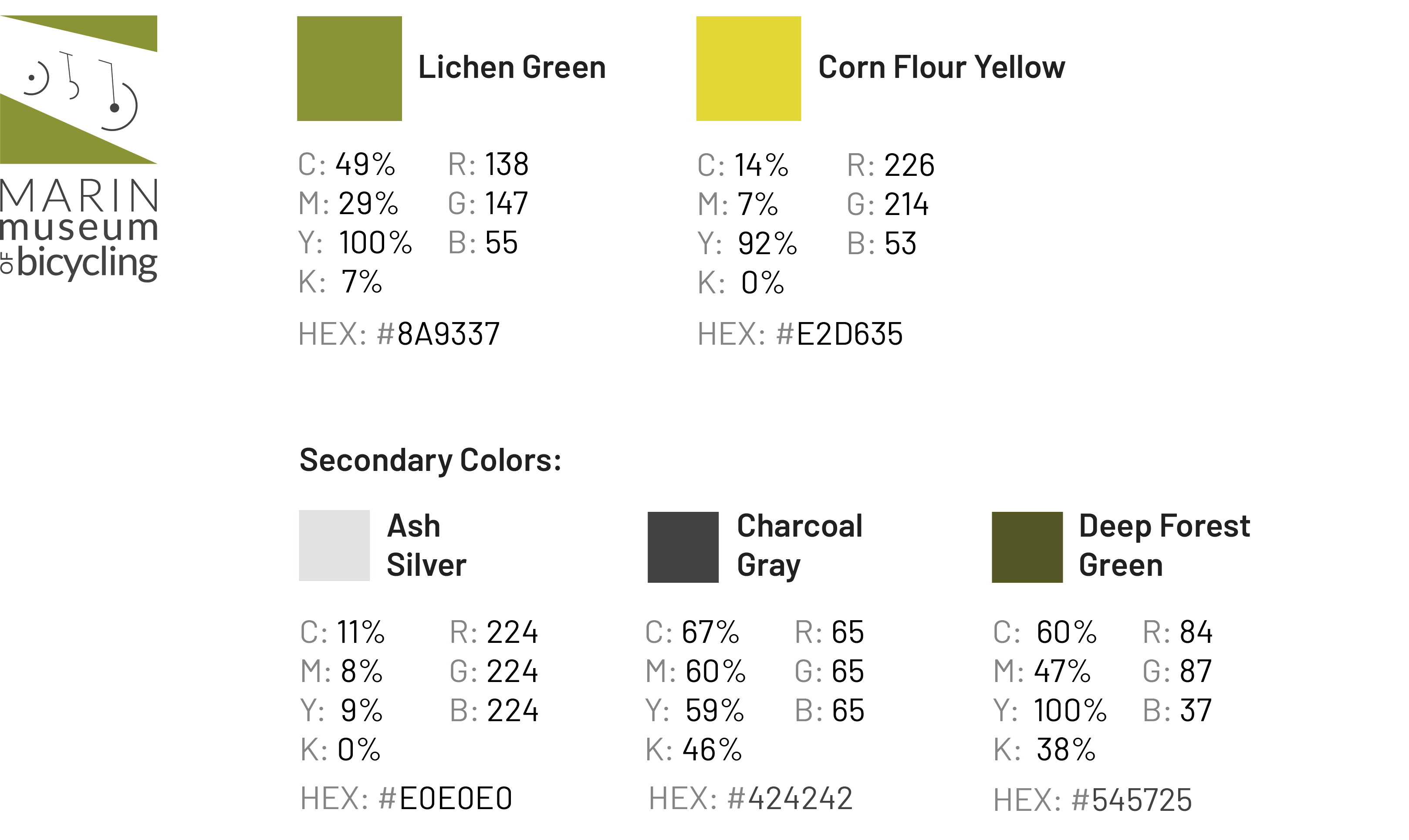
Color Palette
The color palette is earthy: lichen green and corn flour yellow along with metallic grays. It captures a certain organic and healthy mood.
Also, the shades of hue being used have a certain vintage feel to them. This is good since the project is for a bicycle museum which feature classic, vintage bicycles.
Identity
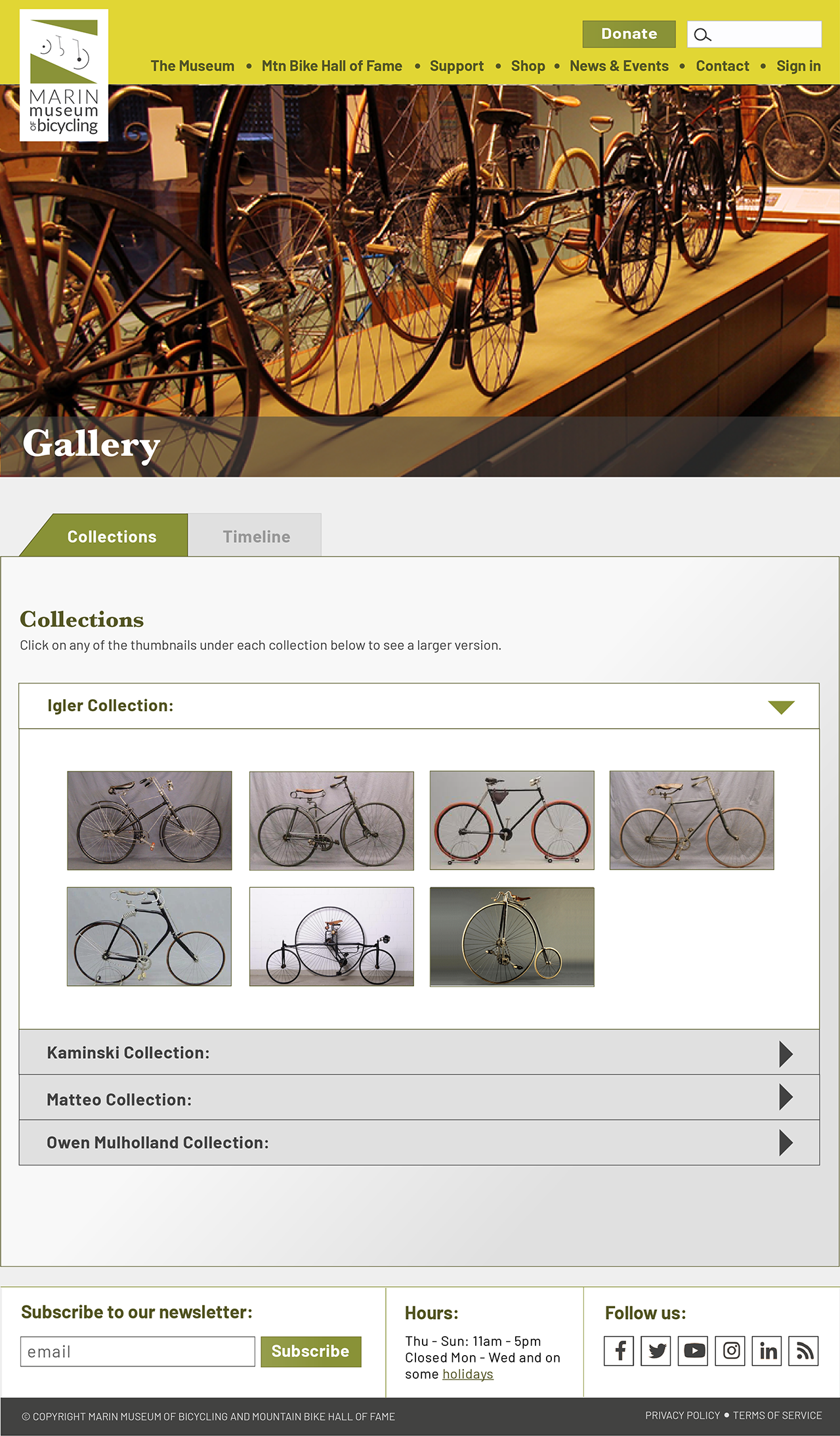
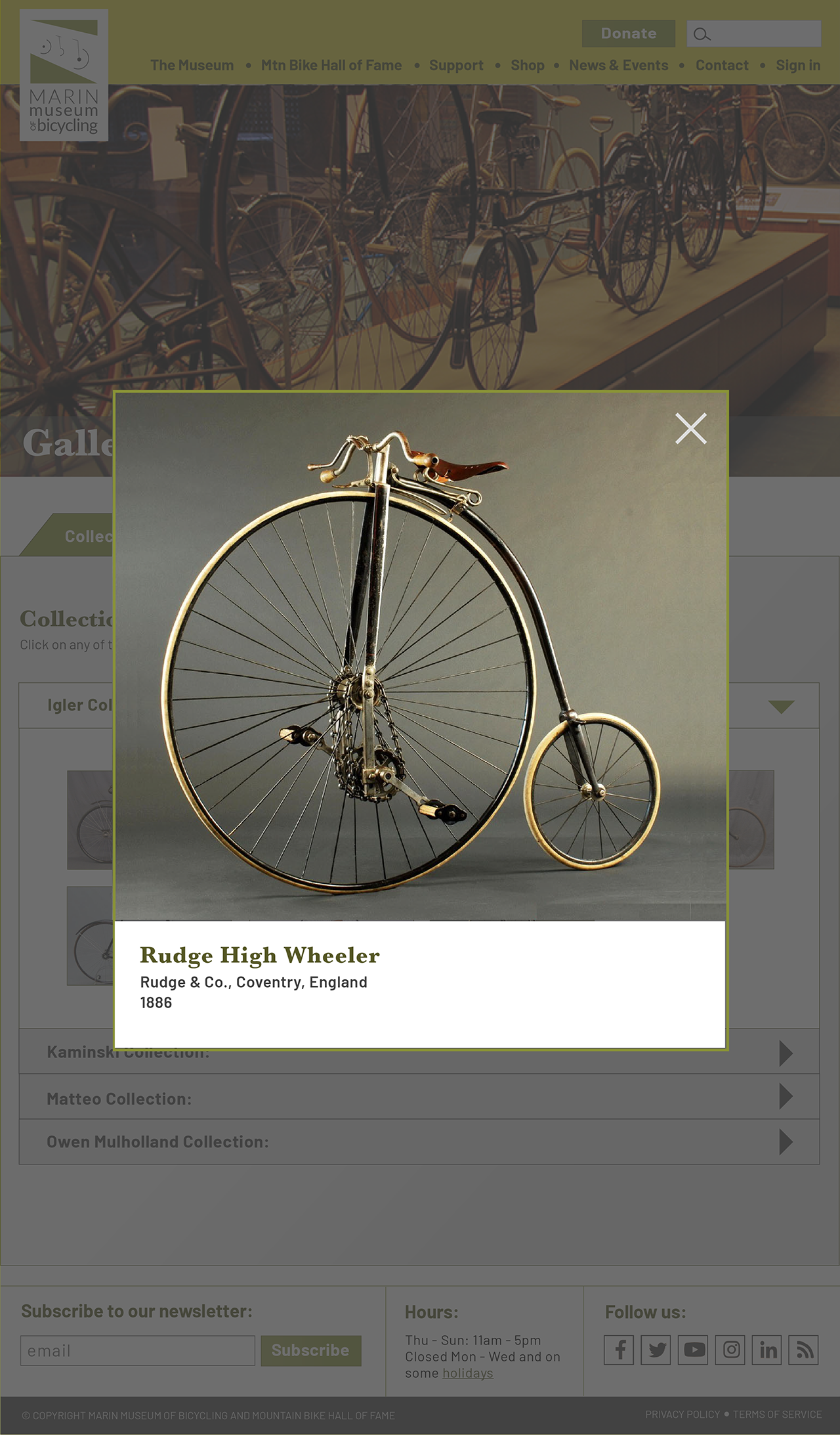
An identity should include letterhead, business cards, brochure(or newsletter) and a website.
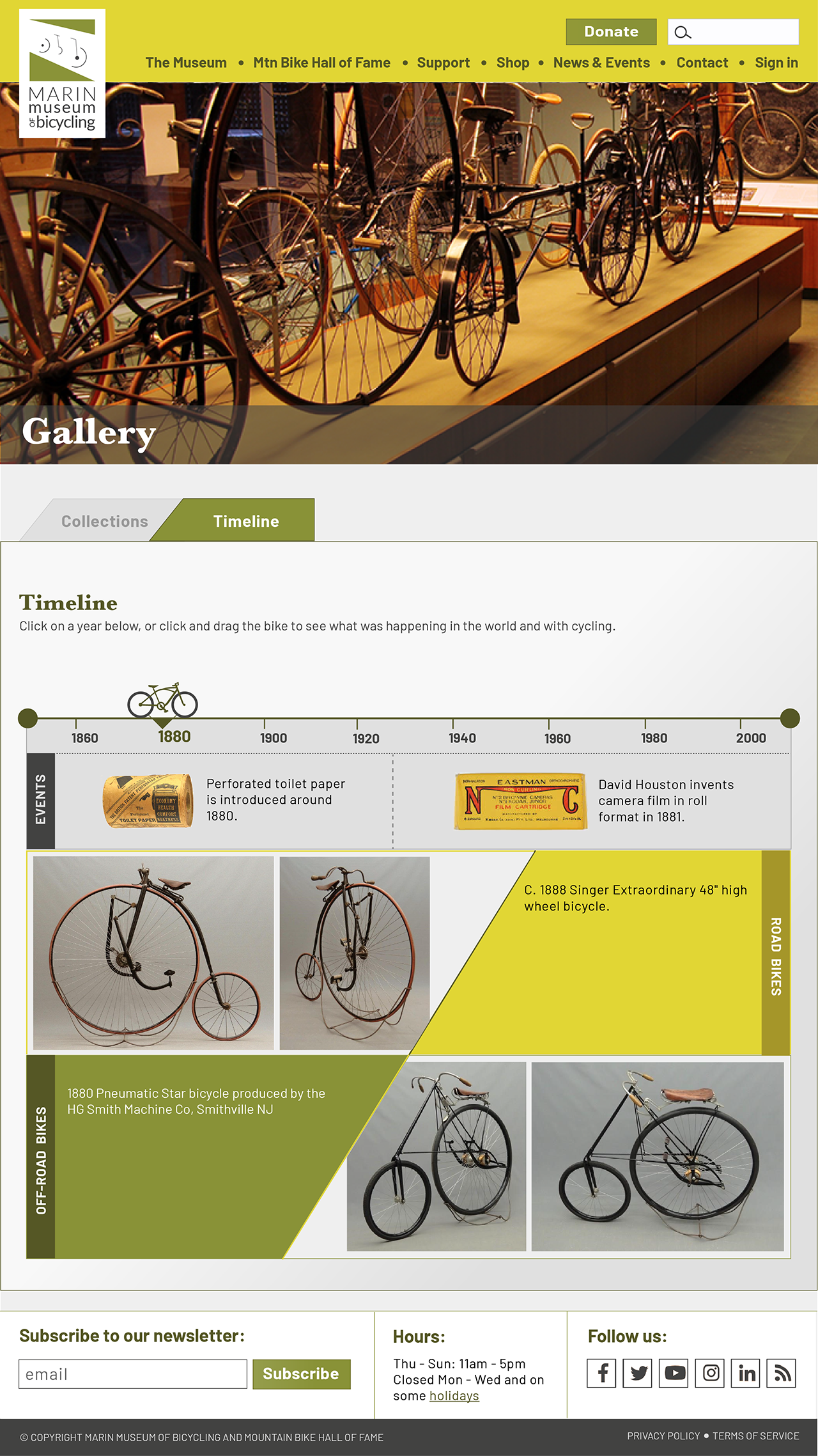
Below are examples of the the letterhead(and envelopes), business cards, brochure and select pages of the website. The branding is kept strong throughout the experience by keeping consistent with the color palette, typography and logo.
Stationary System
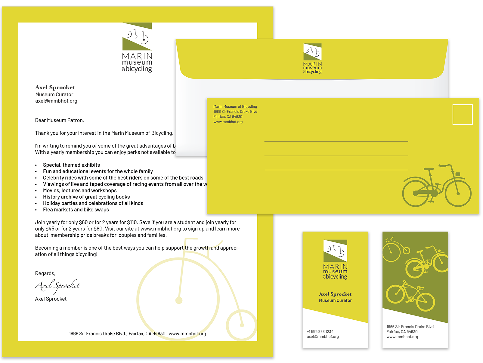
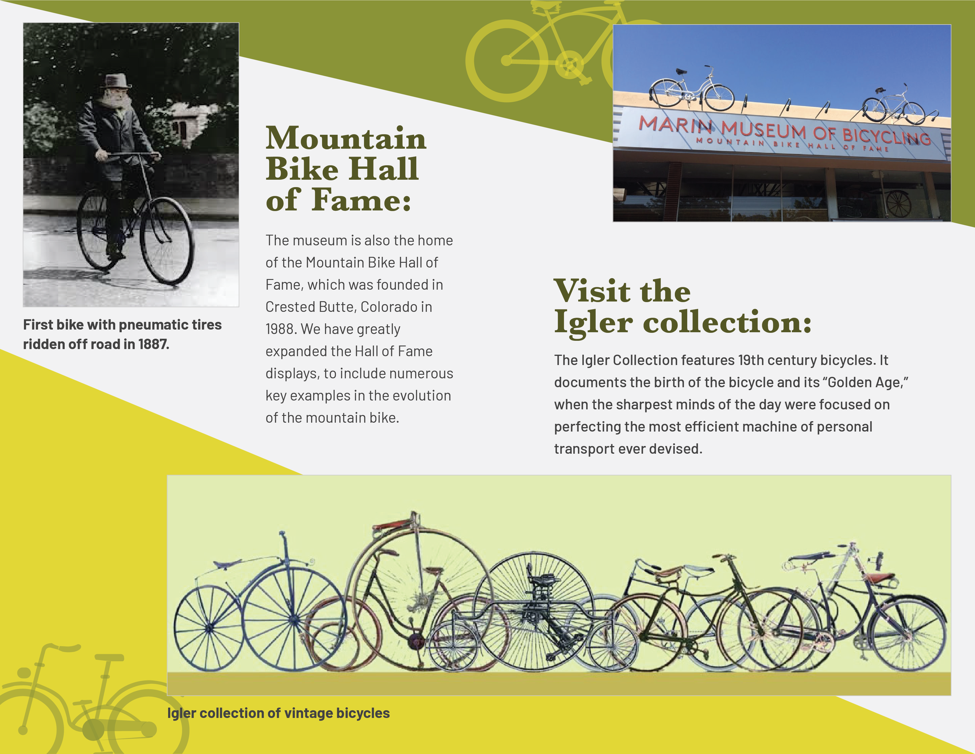
Brochure(outside)
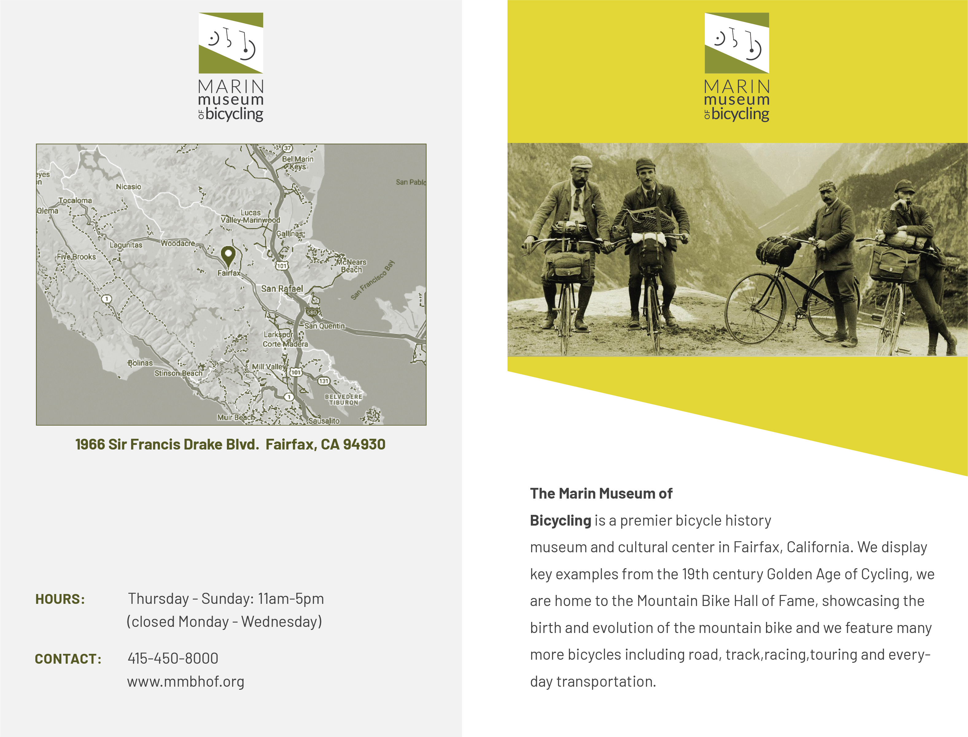
Brochure(inside)
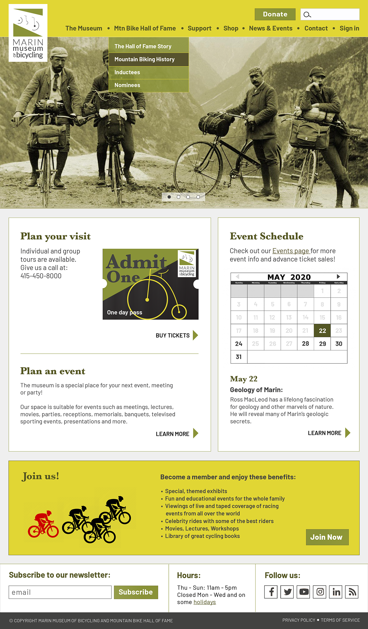
Website Homepage
Website Bicycle Collections
Website Lightbox Example
Website Bicycle Timeline