I was fascinated with this race when I first heard about it and decided to do a visualization using Tableau.
The visualization shows fatalities along the 37.75 mile course on the Isle of Man. It also highlights the years that were the most deadly throughout the race's history.
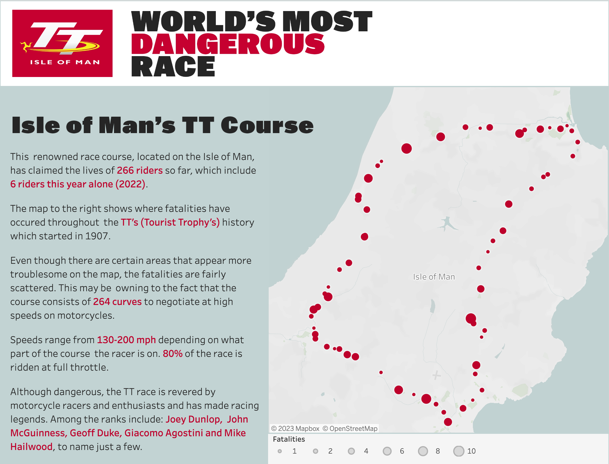
The Course
The course is a 37.75 mile loop on the Isle of Man. It's an atypical course compared to other races where city streets are closed down to the public to allow racers to race on motorcycles at dizzying speeds.
Althought there were points on the course that showed more fatalities than others, I noticed that there were fatal points plotted around the entire course. This may have something to do with the fact that the course consists of 264 curves to negotiate at high speeds.
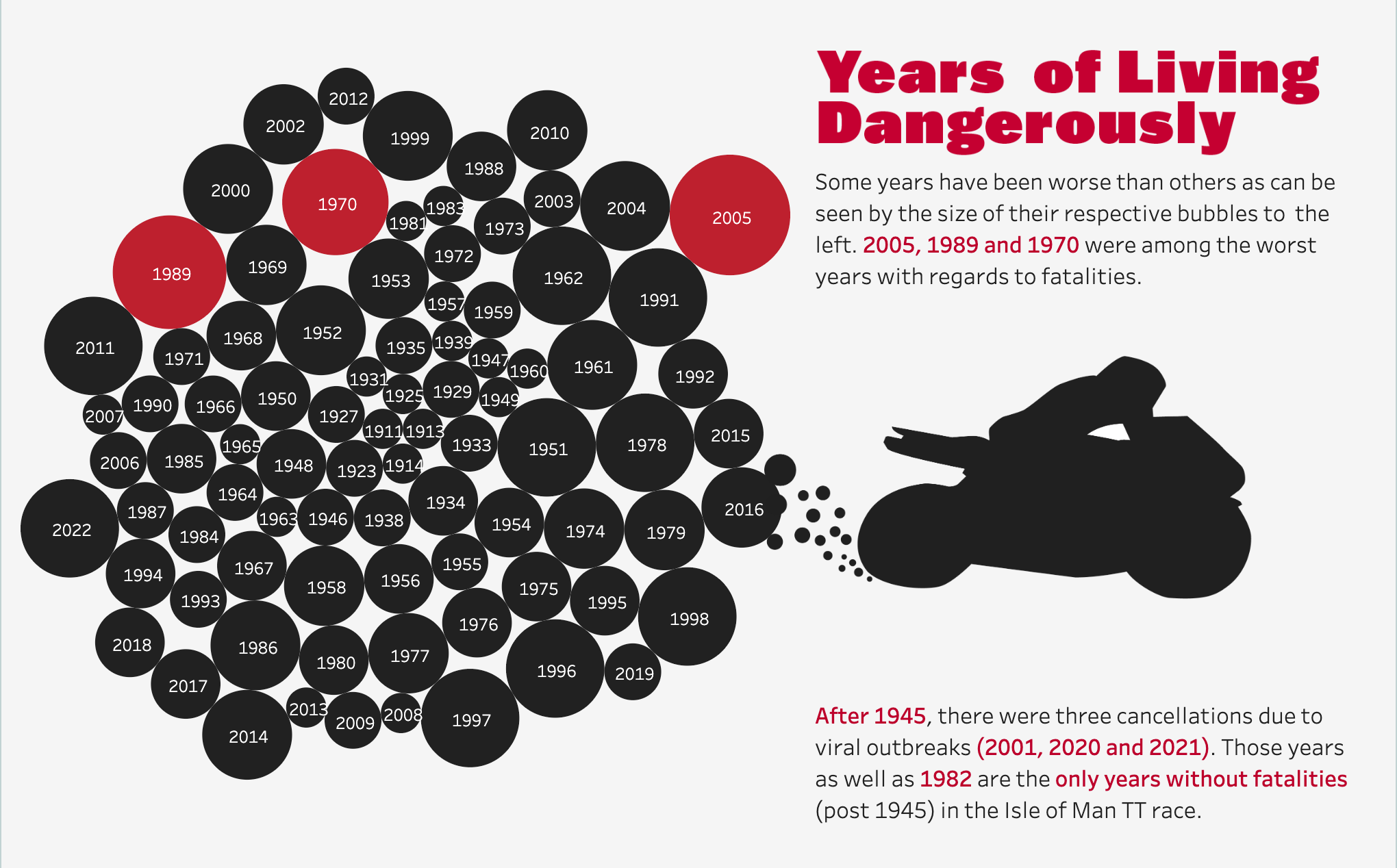
Years of Living Dangerously
I used bubbles to show the relative amount of fatalities per year of the race and highlighted the worst years in red. The worst years turned out to be 2005, 1989 and 1970 with regards to fatalities.
There were only three cancellations of the race after 1945 (2001, 2020 and 2021). These were all related to viral outbreaks. Those three years, as well as 1982, were the only years(post 1945) without any fatalities.
What Makes the Race so Dangerous?
I've highlighted obstacles from a still shot taken from a YouTube video of a racer's point of view. Among other dangers, there are sidewalks, houses(buildings), spectators and lamp posts to be aware of on the course.
The speed has increased over the years as well making the race all the more challenging. Also, as I mentioned above, the course has 264 curves to negotiate at high speeds. Many of these riders will traverse the course over and over in the days preceding the race to make sure they know the course thoroughly.
You can visit and interact with the Tableau visualization here.